Thursday, December 15, 2016

Data Art - Using Point Data From New York City CitiBike

Overview
Most of the labs I’ve done in GIS classes have mostly focused on how to perform different types of analysis and learning new technical features, which is necessary to be able to display the information we want in our maps. However, I really appreciate the opportunity to bring out my creative side while making maps, to make my maps look good as well as being informative for the viewer. Information graphics and data as art is a source of inspiration for me, so I want to recreate some data art in this lab as well as use some new technical features. I was recently introduced to QGIS, and I really like this software. To familiarize myself with this program and practice using it, I decided to use QGIS for this project. A complete runthrough with exact instructions follows.

Goals

  • Technical:
    • Run Python script to create a GeoJSON file
    • Use the “Points2One” Plugin to create a line between two coordinates.
  • Creative:
    • Use the style tab on layer properties and other design features to create an interesting map.

Data
  • Citi Bike has 500 stations in NYC where their users can pick up a bike or drop it off after use. They also have a lot of data available ready to download https://www.citibikenyc.com/system-data such as Trip Histories, Daily Ridership and Membership data, and Real-Time Data. The data is downloadable and can be manipulated into a .CSV file.
    • We are working with Trip History Data was downloaded from: https://s3.amazonaws.com/tripdata/index.html
    • The .CSV file have data from one whole day, June 18 this year which gives about 49 000 trips. This is a lot of data, and it would be interesting to try to limit the data by choosing morning rush hour to see if this limited data would give more distinct patterns. Another possibility would be to see if there is a difference in the patterns on a weekday compared to the weekend.
  • Custom Python Script: (citibike_split.py)
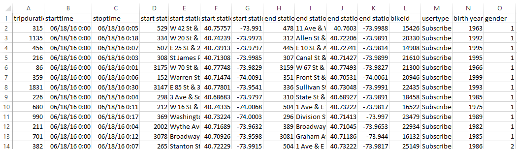
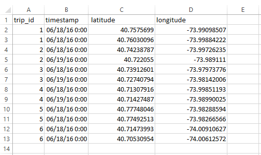
      • The trip data downloaded from the Citi Bike site and extracted as a .CSV file have both start station and end station coordinates for each trip in one row. The python script manipulates the data to fit the format required by the Plugin we are using later, which requires each point to be on its own line, and each point in a specific line must have a shared unique identifier (trip_id). The images below show how the data looks when downloaded as a .CSV file opened in Excel, what the spreadsheet would look like if we would have manipulated the data manually in Excel, and as a GeoJSON file opened in an editor. The custom script is not included in this set of instructions.TripDataPreScript.PNG

TripDataPostScript.PNGTripDataGeojson.PNG

    • The dataset I have provided contains nearly 49 000 rows, and manipulating the data manually would just take too long.
    • For more information about using Python in QGIS, read the PyQGIS Developer Cookbook. For this lab, I have mostly used the parts from Using Vector Layers.
    • The output from the Python script is a file in GeoJSON format, which is a file format supporting encoding a variety of geographic data structures such as polygons and points in addition to related properties. You can read more about GeoJSON here.
  • Baselayer:

Instructions

  1. Open QGIS Desktop and save a new project in a suitable folder.
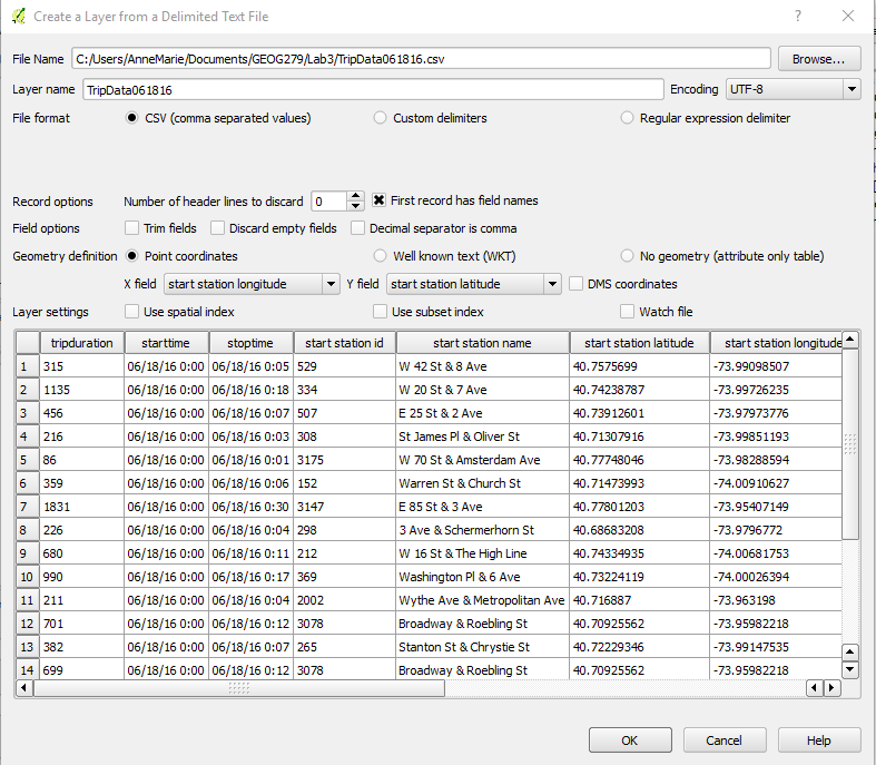
  2. Add the .CSV file by clicking the “Add Delimited Text Layer”AddDelimited.PNG
    1. Browse to your data folder and and find the TripData061816.csv, and enter the following parameters.
      1. Encoding: UTF-8
      2. File Format: CSV
      3. Record Options: First Record has field names
      4. Geometry Definition: Point Coordinates
        1. X Field: start station longitude
        2. Y Field: start station latitude
      5. Click: OK
      6. Use CRS: WGS 84 if the program ask for a CRS, and use this throughout. In some versions of QGIS, the program set this CRS automatically.
AddCSV.PNG
The layer we just added is a geographical representation of the points from the CSV file. We want to see the routes between the two points that belong to the same trip. To manipulate the data in the CSV file in QGIS, we use a Python script to prepare the data for the Plugin that will connect the two points with a new line.

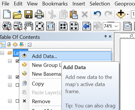
  1. Open the “Python Console” Python Console.PNG
ClearConsole.PNG
    1. Click the “Open Script” button OpenScript.PNG and browse to the “citibike-split.py” file.Doubleclick the file in the explorer window, and QGIS add the file automatically to the right place.
      1. If you can not find the “Open Script” button, ensure that the Editor is showing by clicking “Show Editor”.
      2. IMPORTANT: If you have more than one layer in your project, make sure that the layer with the CSV file is selected in the main window. The script will not run otherwise.

    1. Press “Run Script” RunScript.PNG
    2. Browse to the folder where you want to save the new GeoJSON file that will be created by the script.
SaveGeoJson.PNG
The middle box in the picture above is the console log where any messages in regards to execution of the script is shown.
    1. When the script has run successfully, a message with the path to the new GeoJson file show up in the log window. It is now OK to close the Python Console
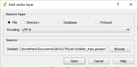
    2. Add the new GeoJSON file as a Vector Layer AddVectorLayer.PNG
      1. Source type: File
      2. Encoding: UTF-8
      3. Browse to the location of your GeoJSON file.
      4. Click “Open”.
AddVector.PNG
The new vector layer is also a point layer and the coordinates are mostly the same as the first layer, so we might not yet be able to see any changes in the data.
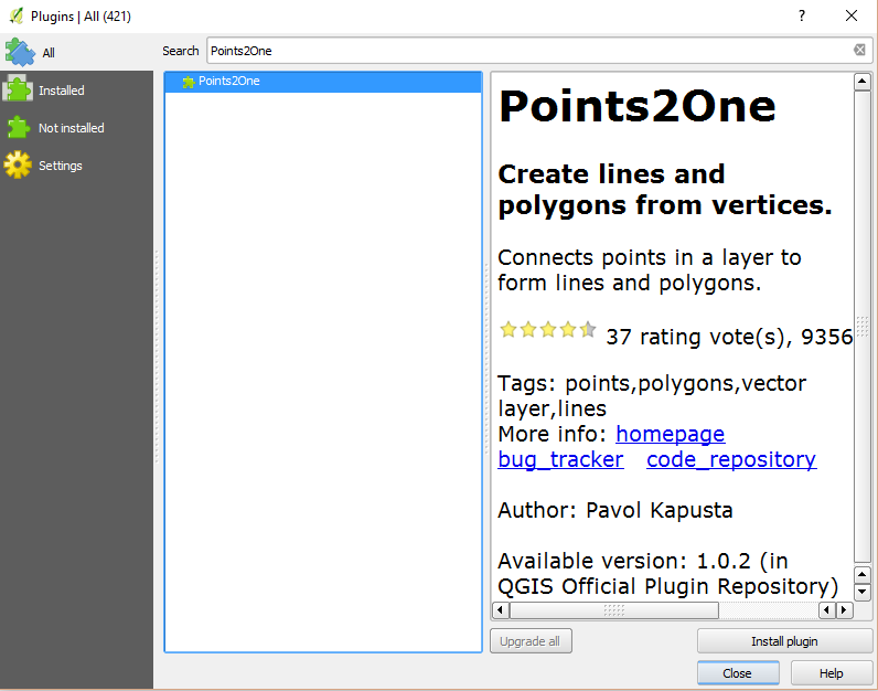
  1. Run the Plugin: Points2One
    1. The Plugin is not a standard feature in QGIS and needs to be installed.
      1. Go to: Plugins -> Manage and Install Plugins... on the main menu.
      2. Ensure that “All” is selected on the left hand bar.
      3. Search for “Points2One” and install the Plugin.
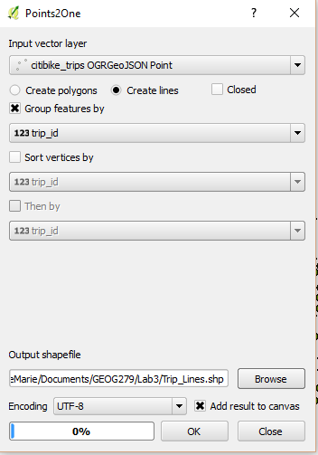
InstallPlugin2.PNG
    1. Find the new Plugin Points2One.PNG and run it with the following parameters (if you can not find it, it is also available on the “Vector” menu)
      1. Input vector layer: Use the new vector layer created from the GeoJSON file
      2. Check “Create lines”
      3. Check “Group features by” and choose the “trip_id” as the unique identifier from the dropdown menu.
      4. Select encoding “UTF-8”
      5. Browse to store the new shapefile in a suitable folder.
      6. Check “Add result to canvas”, and the new layer is automatically added when the tool is run.
      7. Click OK to run the tool. When it has finished, click Close.
Plugin.PNG

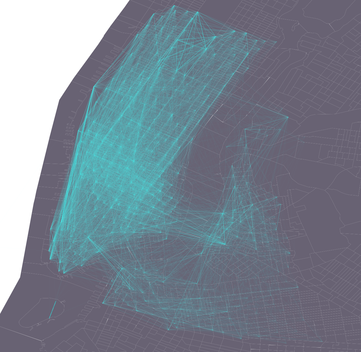
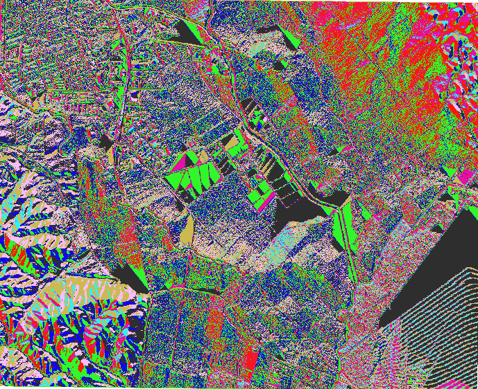
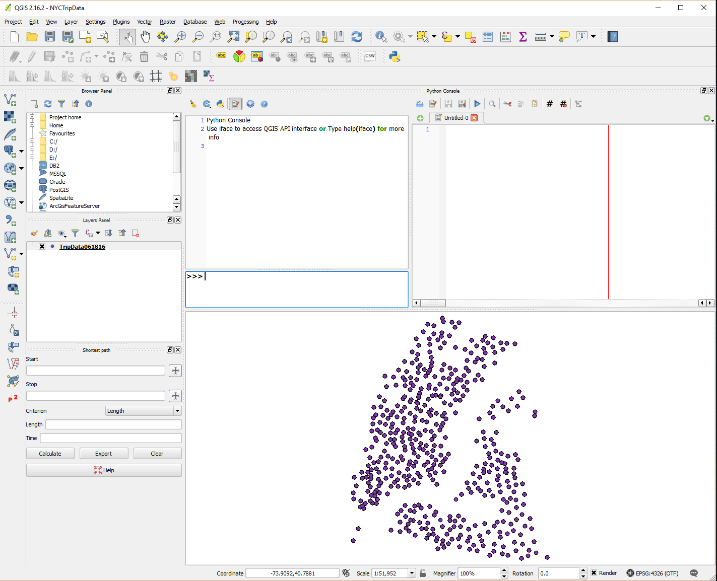
The new vector layer displays all the trips as lines that are registered in the TripData061816.csv file between the start and end points. All together all the lines in the new layer will vaguely resemble the southern end of Manhattan Island and the surrounding area of Brooklyn and Williamsburg.

Link to video tutorial:


5. Creativity
  • Add base layer and change the look of the features to enhance the patterns the lines create.
  • One visual effect we can do with this specific type of data is to increase the transparency of the layer with the lines.
Suggested result.PNG


3D Analyst Toolbar - Profile Graph Tools

Have you ever been on a hike and wondered how many feet you have walked up or downhill through the day? I certainly have, and by knowing how to use the 3D analyst toolbar in ArcMAP, I can create an elevation profile for a hike, as long as the necessary data is available.

Below, the image show a High Resolution Orthoimage with a Digital Elevation Model layered on top to create a pseudo 3D map of the Mount Diablo area in California.


In the image below you can see the elevation graph that corresponds to the line in the image above. The graph starts with the starting point in the lower end of the line.


This graph was created by using the “Interpolate Line” tool in the 3D Analyst toolbar. This tool can be used on raster, triangulated irregular network (TIN), or terrain datasets. A line can be drawn directly on the map, as the example above, or over a series of points. Then I used the Profile Graph tool to generate the graphic representation of the line.

Sources:

So Many Ways to Add Data


While working with GIS, a lot of time is spent trying to minimize redundancy and striving to make processes work as fast as possible. Therefore I find it interesting how there are so many operations in ArcMAP that you can do in multiple ways with the same result. There are at least three ways to add data to your data frame, not counting adding X,Y data. Here’s a quick run through:

  1. Right click layer then choose Add Data.

  1. Use “Add Data” icon on toolbar. Here you can click the icon, or use the little dropdown menu on the side for more options.

  1. Use ArcCatalog and use the drag & drop method to add files. You can open ArcCatalog in a separate app or in ArcMAP.


  1. Use the menu: File -> Add Data -> Add Data

ArcScene Animation

ArcGIS has built in tools for creating animations of 3D models. While working on a visibility project, I used ArcScene and the animation manager to create an animation of the 3D model i had made.

Using the Fly Tool in ArcScene takes a little practice to work, and in the beginning it may be challenging staying close to the model, and not disappear into space.


Sources:

Create Districts - Modify Edge Tool 3/3

See part one and two of the create districts series.
Based on the polygons created by first using the “Create Thiessen Polygons” tool, then the “Dissolve” tool, the districts are now ready to be edited to fit better with the landscape in which they are located. As you can see, some of the borders between the districts are fairly irregular, while the border between district 5 in yellow and the upper left corner of the blue district is much smoother and follow roads.


This particular border has been manually edited using the “Modify Edge Tool” from the Topology toolbar. I found it useful to have the streets basemap layered under the district feature layer, and adjust the transparency of the district feature class so that you can see the streets through the top layer. Then, start an editing session using the editor toolbar, before selecting the “Modify Edge Tool”, the second from the left on the topology toolbar, and start to adjust the borders to follow streets or other natural features.

Remember to save your edits when all the borders are adjusted. The result should be a set of district that are easily manageable according to your project's individual needs.

Sources:

Create Districts - Dissolve Tool 2/3

The “Create Thiessen Polygons” tool create one polygon around each data point in a point feature class, which may be useful if there is a limited number of points. To create more manageable districts for larger data sets, the “Dissolve” tool can be used to merge Thiessen Polygons (see part 1 about this tool here) into larger polygons.

The Dissolve tool is located under “Data Management Tools” in the “Generalization” toolbox, and create features based on one or more specific attributes. This means that when setting the parameters for the tool in the popup box for this tool, you choose input layer, define output feature class and you can choose which field to perform the tool on. Features that share the same value for the selected field will be dissolved into one feature and the written to the output feature file.


The image below show the output feature class after running the Dissolve tool on the Thiessen Polygon layer from an earlier post.


See part three of this series here.

Sources:


Wednesday, December 14, 2016

Hydrology - Flow Accumulation 3/3

The final installment of the Hydrology trilogy: Flow Accumulation, see part one and two. This tool calculates accumulated flow based on the weight of all cells flowing into each downslope from the input raster. A weight of 1 is applied if no weight raster is provided, and the value 0 is used to identify ridges. The output value from each cell is the number of neighboring cells flowing into the center cell. Cells with high accumulation values may be used to identify streams..

The image below show accumulated flow calculated on the data shown in the flow direction post.

Create Districts - Create Thiessen Polygons 1/3

The proximity toolset in ArcMAP contains multiple tools to calculate proximity. According to the ArcMAP documentation these tools can be used to: “determine the proximity of features within one or more feature classes or between two feature classes”.


The “Create Thiessen Polygons”  is a proximity tool that calculates polygons from a point feature layer. Each polygon contains one feature point, and any location within a polygon is at anytime closer to its allocated point than to any other point input feature. The size of each polygon can vary greatly based on the dispersion of the point input features.


The Delaunay triangulation method is used to calculate the polygons which works best in a projected coordinate system, and may therefore yield unexpected results in a geographic coordinate system.

See part two and three of the series.

Sources:
Create Thiessen Polygons

Proximity Tool Set

Hydrology - Flow Direction 2/3

This is the second installment of the Hydrology trilogy focusing on the Flow Direction tool. See part one here and part three here. As the title suggests, this tool calculates the direction of water flow on a surface. As long as a cell is not located along the edge of a dataset, it has eight neighboring cells, and therefore eight different directions to flow, and will move to the neighboring cell with the greatest negative elevation difference over distance. The only exception is if there are no neighboring cells with a lower elevation, which means it may be a sink, and will be unclassified. Distance is measured from the center of each cell and, diagonal cells are therefore at a greater distance from the center cell. This means that the flow direction may not be calculated purely on the greatest difference in elevation.


The cells that have the same flow direction and are located next to each other create clusters of cells with the same color. These cluster creates patterns, and it is possible to identify the mountain area in the lower left corner.